Increasing supplier engagement with a rebuilt insight report tool.
2024 · Marcura / ShipServ
- Role
- UX lead
- Project length
- 2024
- What shipped
- Rebuilt insight dashboards
- Impact
- 130+ daily users · near-instant queries
Rebuilding a legacy reporting tool into something suppliers actually wanted to open.
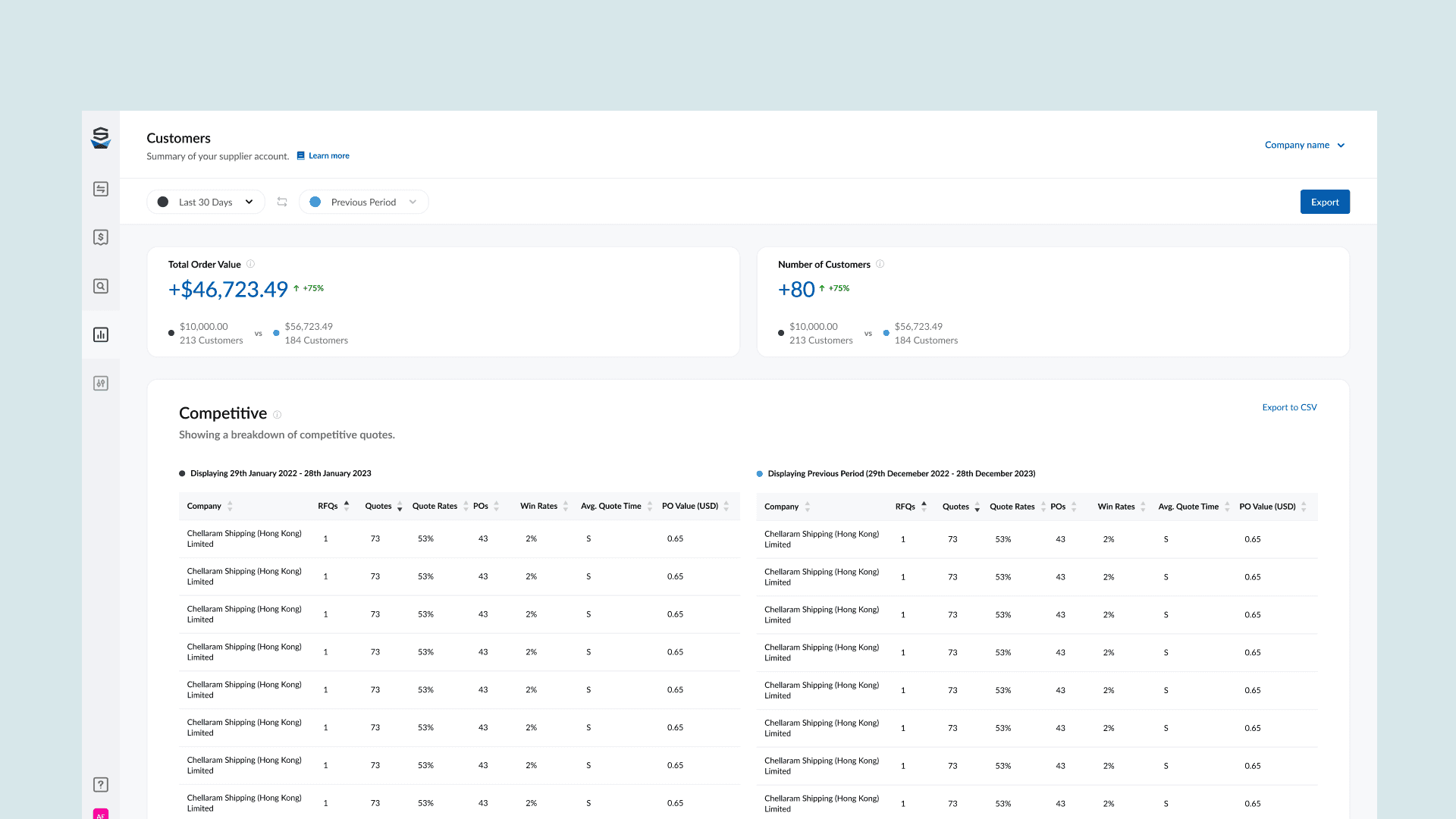
ShipServ's supplier insight tool let international suppliers analyse, benchmark, and compare their procurement data. The legacy version was slow and limited, and engagement had drifted. I led the UX of the rebuild, from generative research through to a tested, shipped set of dashboards.
The Impact
- 130+ daily users on the rebuilt tool
- 4% of suppliers upgraded tier
- 77 SUS score, up from the legacy baseline
- Query load time cut from 2-3 minutes to near-instant
Problem
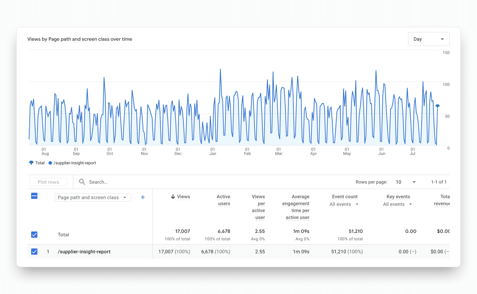
Suppliers had a reporting tool, but most weren't using it. The legacy insight tool was slow, sometimes taking two to three minutes to load a single query, and it was missing the things suppliers actually wanted: a way to export their data, compare periods properly, or drill into a number that looked off.
That matters because the insight report is one of the few places a supplier sees the value of trading on the platform. A slow, shallow tool gets abandoned, and an abandoned tool does nothing for engagement or retention. The job was to rebuild it into something suppliers actually wanted to open, fast, useful, and worth coming back to.
Business goals
- Redesign the supplier reporting tool, improving both usability and look and feel.
- Move legacy users across to the new tool on the trade platform.
- Give suppliers metrics valuable enough to drive engagement and retention.
My role
As UX designer, I owned the experience end-to-end and made the calls on how the data was structured and surfaced.
- Designed full end-to-end flows for multiple supplier dashboards, not just the insight report.
- Led the generative research phase, starting with relationship managers and then legacy suppliers directly.
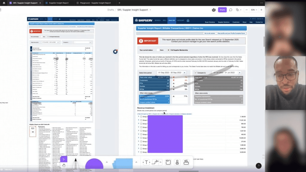
- Chose to do a hands-on deep dive of the legacy tool myself, which surfaced requirements the brief had missed.
- Set up the team's first PRD so requirements and artefacts lived in one place rather than scattered.
My approach
Start with the people who already knew the tool, design against real data rather than placeholder numbers, and treat performance as a design problem, not just an engineering one.
Research
I started with the relationship managers. They'd spent years close to the legacy tool and knew exactly how suppliers used it, what worked, what didn't, and where the real value sat. That gave me a baseline fast, without starting from a blank page.
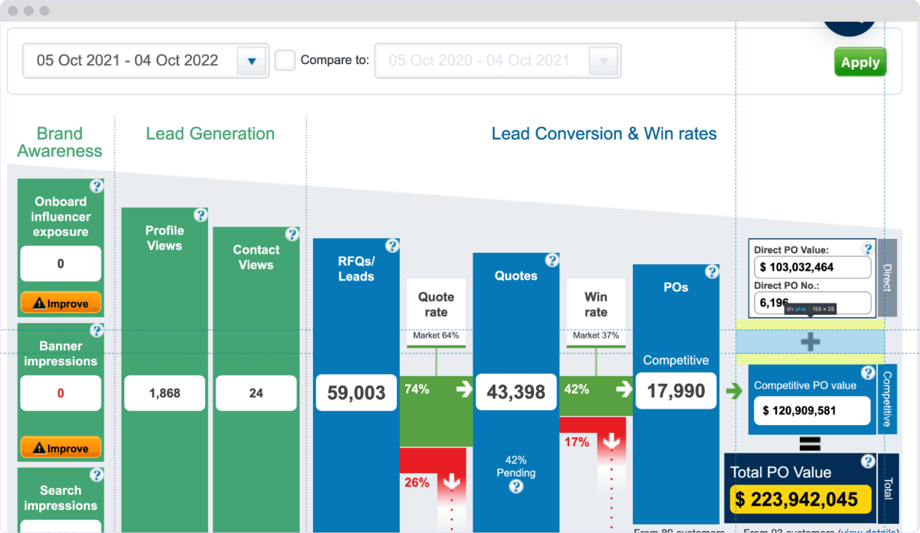
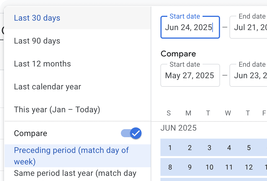
From there I went to the source: I identified current legacy users and interviewed them directly about the tool and what they wished it did. I also looked outward at how other analytics products handled data, especially comparison data, which kept coming up as a pain point.
Issues we identified
Four problems came up consistently, across both the managers and the suppliers.
- No way to export. Suppliers couldn't get their data out, so they couldn't manipulate or present it the way they needed.
- Weak comparison. Comparing periods was valuable to suppliers but handled unconvincingly, which is the exact thing they wanted the tool for.
- No deep dives. Suppliers liked the surface numbers but routinely wanted to know the story behind a single data point, and the tool stopped at the surface.
- Painfully slow. Queries could take two to three minutes to load. That alone was enough to turn suppliers off opening it at all.
Each one fed a clear design response. Export and deep dives were about giving suppliers control over their own data. Comparison was the core job to get right. And performance wasn't a nice-to-have, it was the difference between a tool suppliers used and one they abandoned.
Ideation
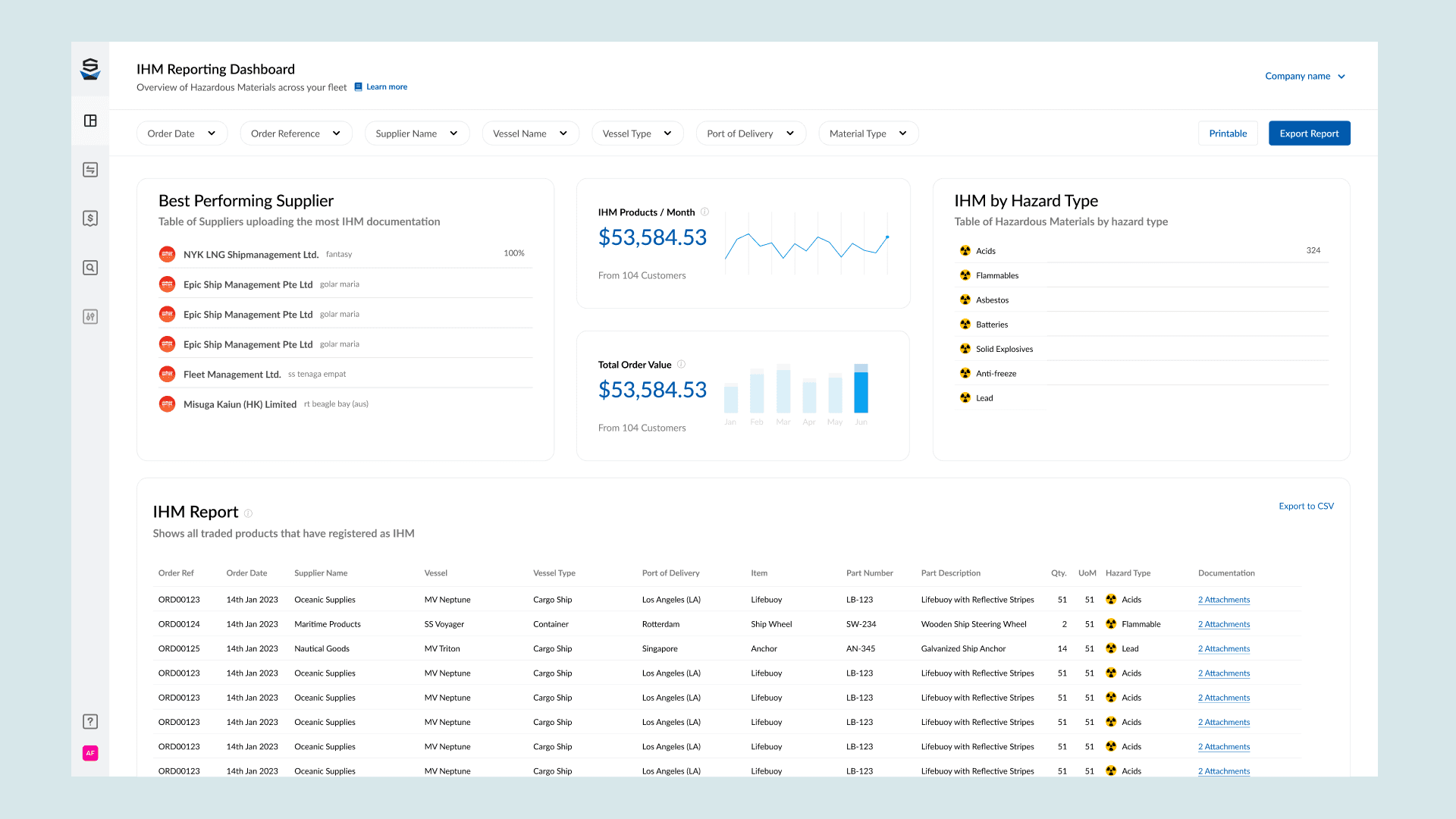
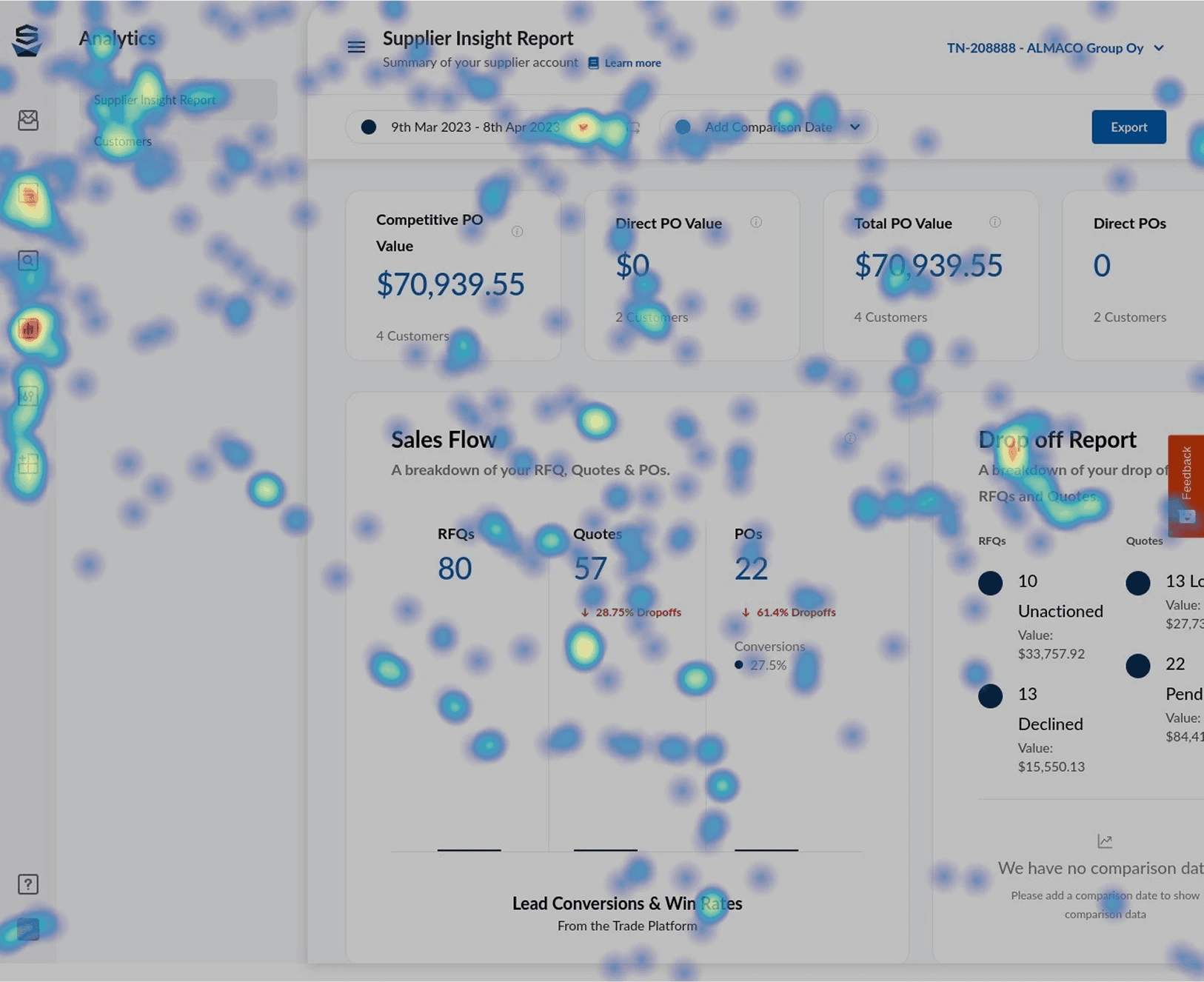
Before designing screens, I did a hands-on deep dive of the full legacy reporting suite myself. Reading the brief wasn't enough. Using the old tool surfaced details that had been missed in the requirements, and gave me a real feel for the data I had to work with, the customer breakdowns, the revenue and transaction views.
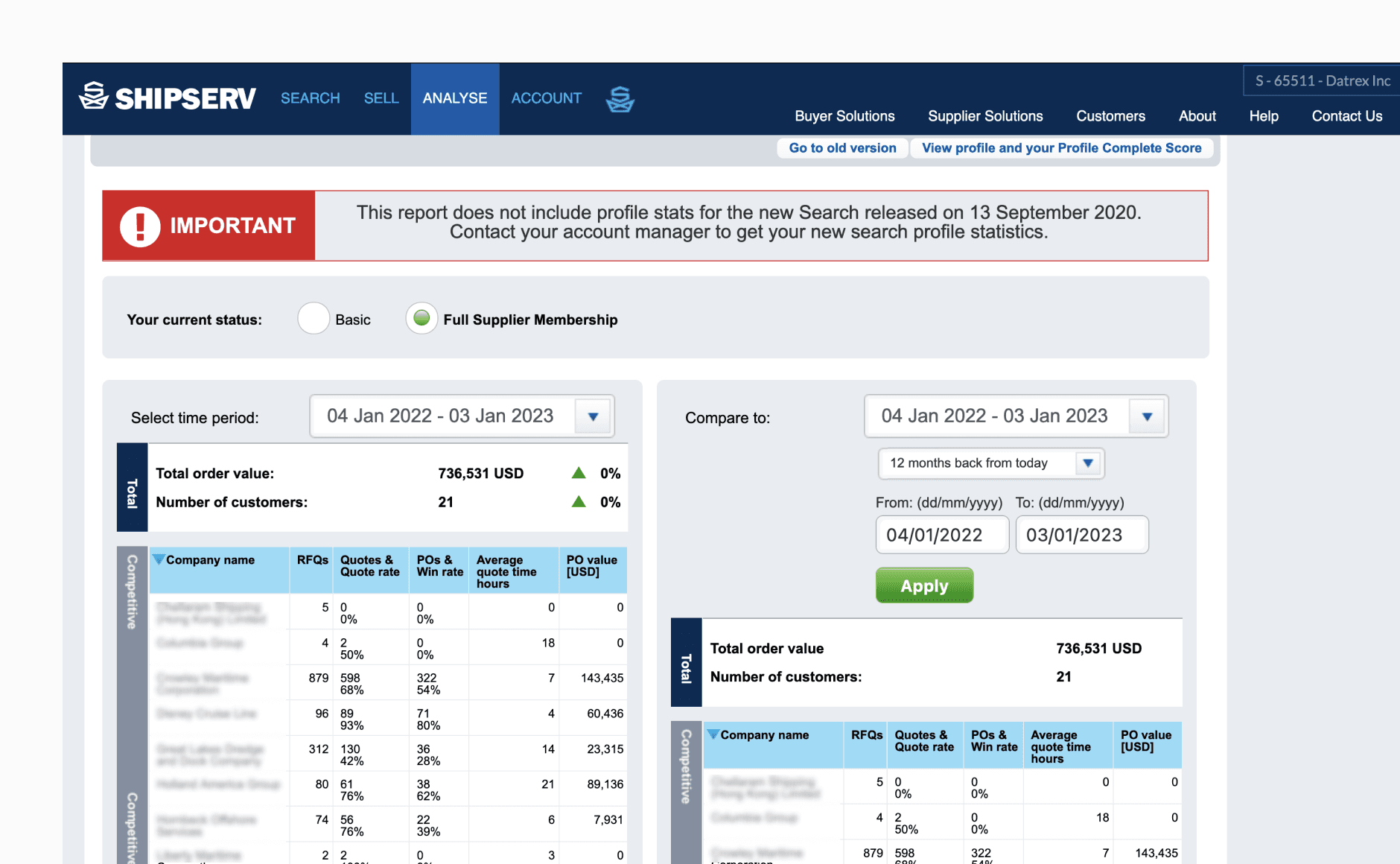
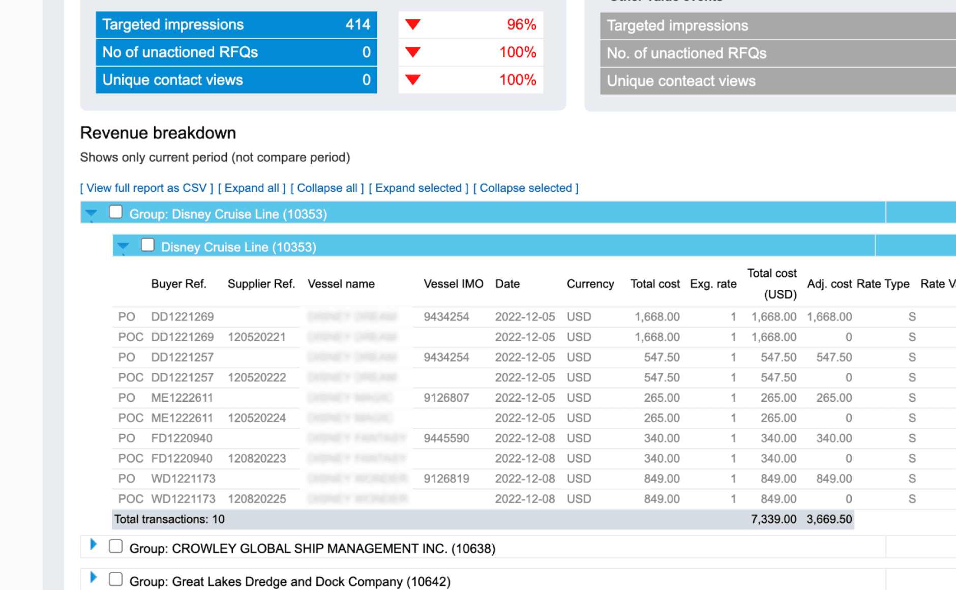
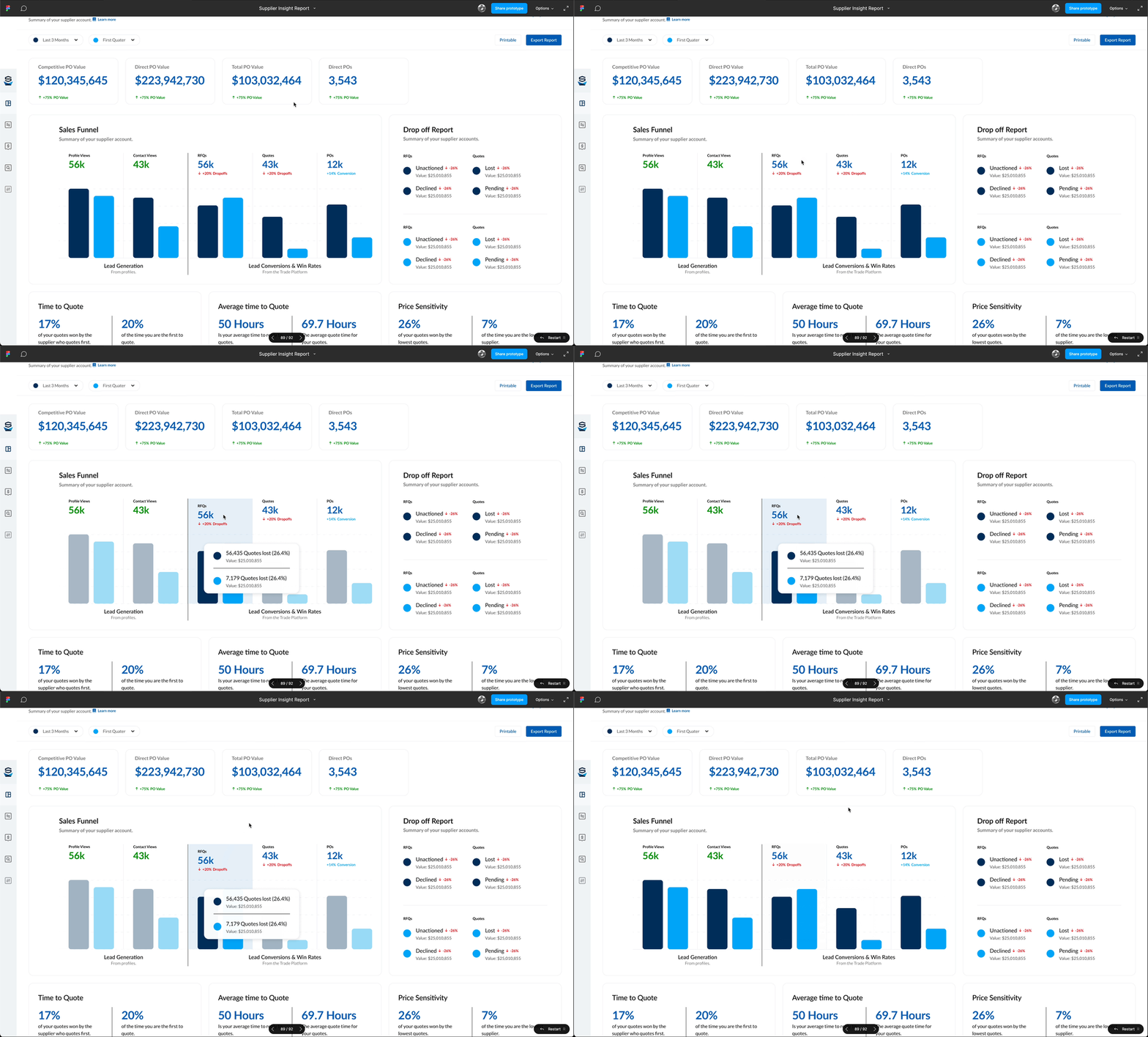
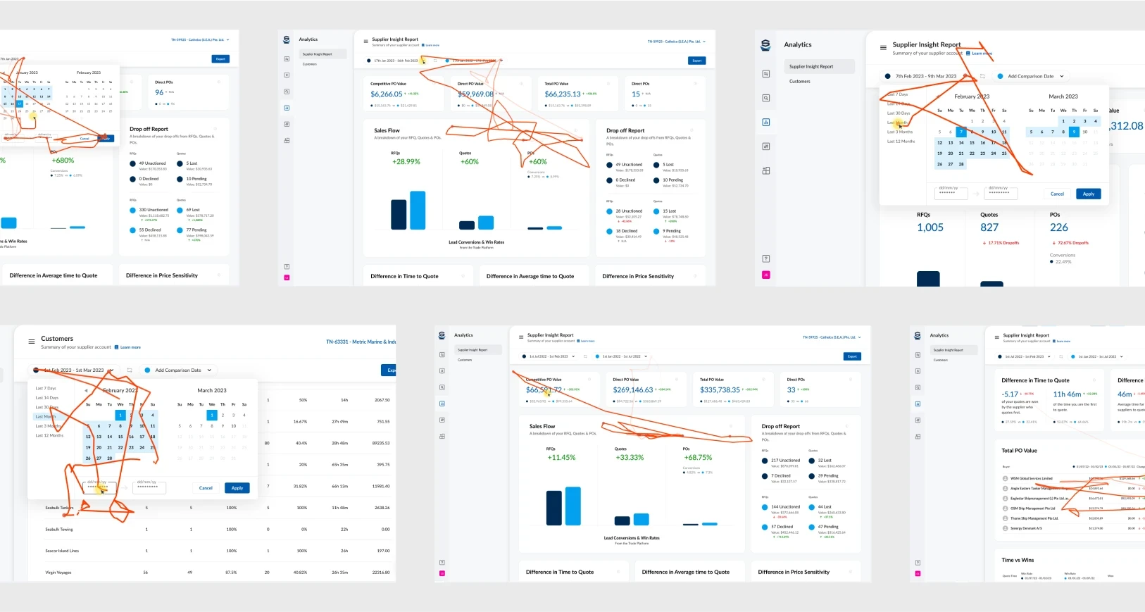
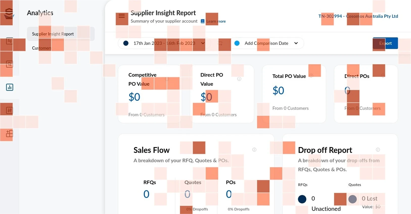
From there I experimented with how to display the data, getting internal feedback on different visualisation approaches, then worked through how a user should interact with a number to drill into it. I also identified the components we'd need to build to make the tables work the way suppliers expected.
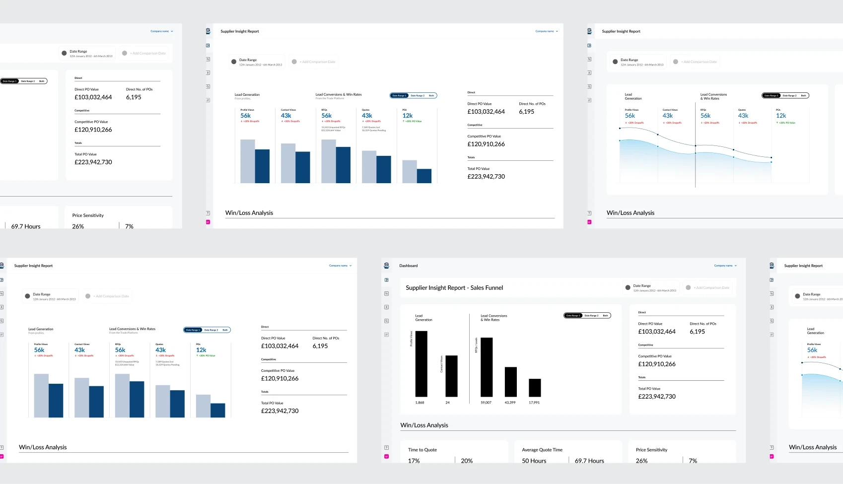
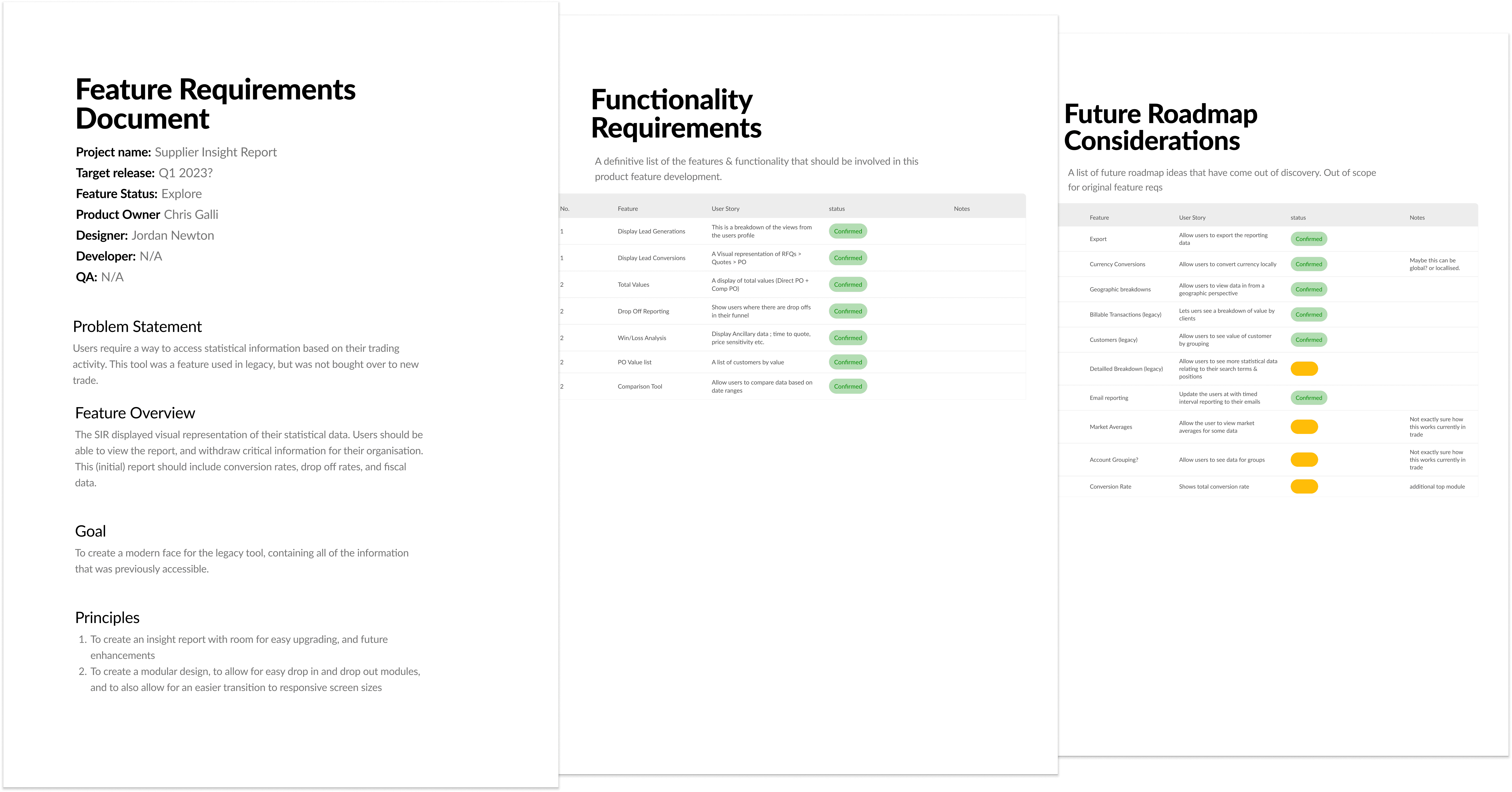
Concepts
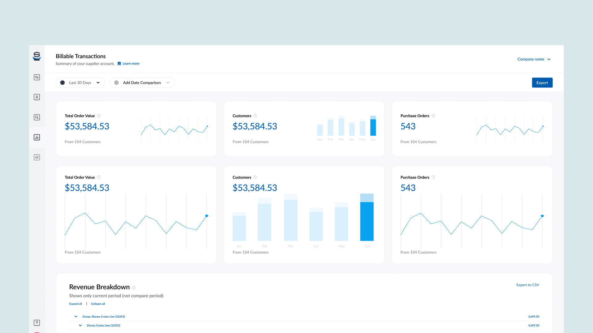
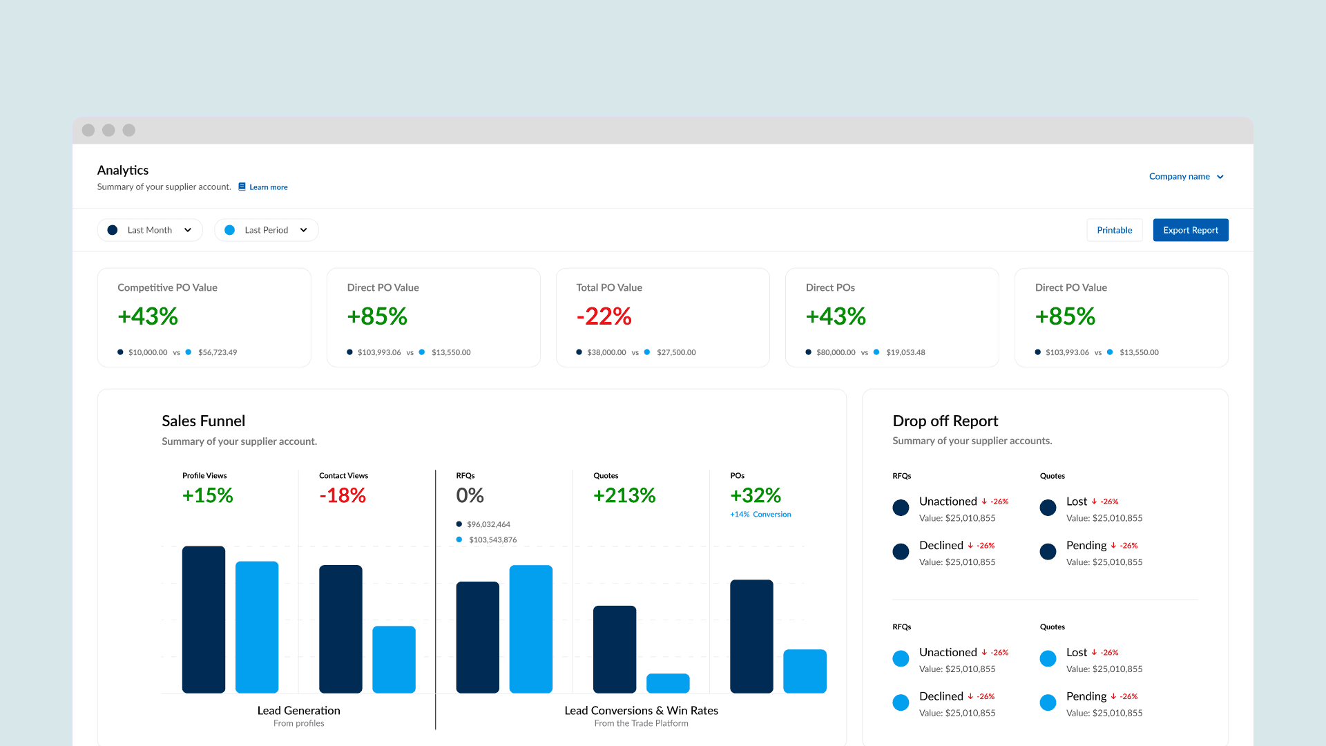
I built prototypes of the two flows that mattered most, the ones that mapped directly to the biggest issues from research.
Testing
I tested the prototypes with legacy suppliers, asking them to complete real tasks: finding a specific number, comparing two periods, drilling into a data point. The point was to see whether the new structure actually made the data easier to reach.
- 85% task success rate
- 6 out of 7 average ease-of-use score
- 71 SUS score at the prototype stage
Refinement
Testing surfaced two issues worth fixing before launch, both small changes that made a real difference.
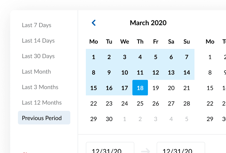
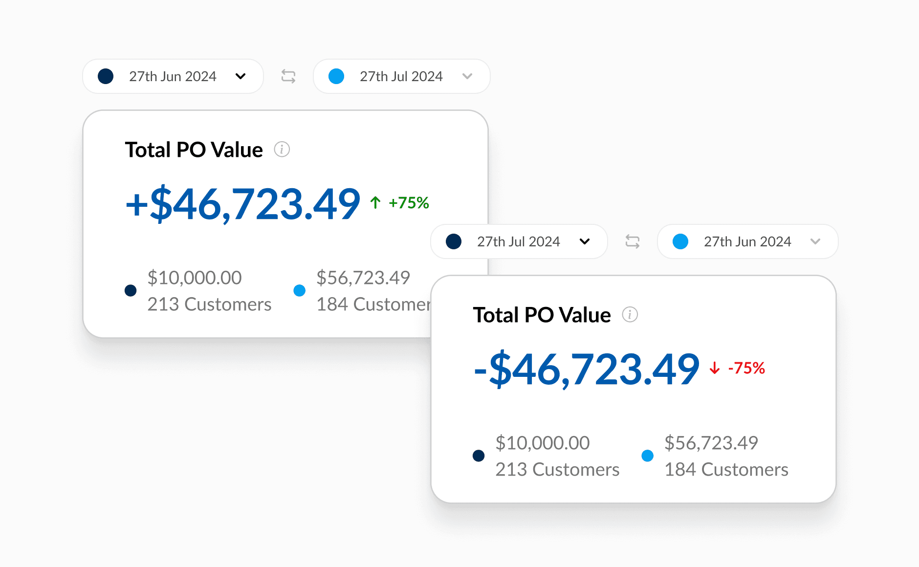
The first was the date picker. Depending on which date a supplier picked first, the comparison calculation flipped, which quietly produced the wrong answer. I added a switch so suppliers could choose the direction of the comparison (compare to, or compare against) rather than guessing.
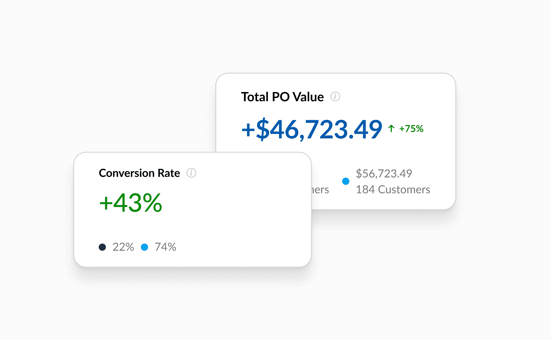
The second was comparison display. In comparison mode, suppliers cared more about the actual values than the percentage difference, so I made the value the prominent figure and demoted the percentage.
Launch / Outcome
We finished the development across multiple dashboards, including the supplier insight report, and released them to production behind a feature flag after a QA cycle. From there we kept measuring and made small data-led enhancements.
- 130+ daily users on the rebuilt tool.
- 4% of suppliers upgraded tier, the engagement the rebuild was meant to drive.
- 77 SUS score in production, up from the legacy baseline and above the prototype's 71.
- Load times cut from 2-3 minutes to near-instant, removing the single biggest reason suppliers had abandoned the old tool.
Measured against the three goals: the tool was redesigned and scored well on usability, legacy users moved across, and the metrics gave suppliers a reason to keep coming back.