Insight Report
Increasing supplier engagement by launching an insight report tool that surfaces key trading data.
I was the UX designer involved in recreating our legacy insight dashboard tool for international suppliers, allowing them to analyse, benchmark, and compare their procurement data.
The Impact
→ 130+ Daily Users
→ 4% Tier Upgrades
→ 77 SUS Score
ROLE
UX Designer
TEAM
UX, Engineering
TOOLS
Figma
Loveable
Maze
Miro
Power BI
Datahub
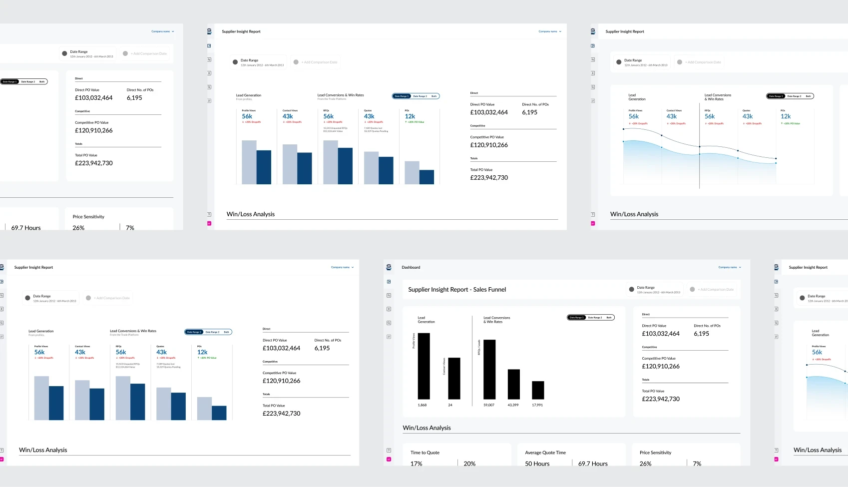
Final Solution
Problem
Most suppliers provided basic transaction data, but only a small portion included key business details that could unlock strategic insights. Without this context, it was difficult to assess supplier performance, identify risks, and support procurement decisions with meaningful data.
We wanted to understand what information was valuable to suppliers, and what we could do to encourage more complete data capture, turning supplier insights from nice-to-have, into valuable, enriching data.
Business Goals
1
UX redesign of Supplier Reporting
Take our legacy tool and improve the usability, as well as look and feel
2
Successfully transitions users from legacy
Move over our legacy users that still use the report to the trade platform
3
Provide users with valuable metrics to drive growth
Present suppliers with valuable data to improve supplier retention
Role
As the UX designer, I worked through ideation, iteration & testing
→ I created full end to end designs for multiple supplier dashboards
→ I led the generative research phase, speaking to multiple legacy suppliers
→ I worked closely with engineering and data science team
→ I tested the dashboards with legacy suppliers and implemented feedback
Legacy Supplier Report
Research
Uncovering Legacy
I took to speaking to our relationship managers, who had extensive knowledge of the legacy tool. They gave me a good starting point, telling me how suppliers currently use it, what works and what doesn't, and where they see clear value with the tool.
Research
Internal & External Research
User Interviews
User Interviews
I identified current legacy users, and reached out to have a conversation with them about the tool and get their feedback
Google Analytics Compare
Market Research
I also wanted to take a look around at other analytic based applications, to see how they handle data, especially comparison data.
Research
Issues we identified
1
Data Exporting
Currently, there was no way to extract the data, so users couldn't manipulate the data like they wanted.
2
Data Comparison
Data comparisons where important, but were not handled convincingly. The ability to compare data is valuable for the supplier
3
Deep Dives
Users liked the surface level data, but often wanted to know more information about a data point.
4
Performance
Currently, the insight tool took sometimes 2 - 3 minutes to load a query. this frustrated users, which turned them off from using it.
Research
Current Design
To get a more holistic view of the full suite of reporting tools, I took to legacy to do a deep dive myself. I found lots of nuggets, which had originally been missed in the requirements, and also got a good idea of the data that was available to me.
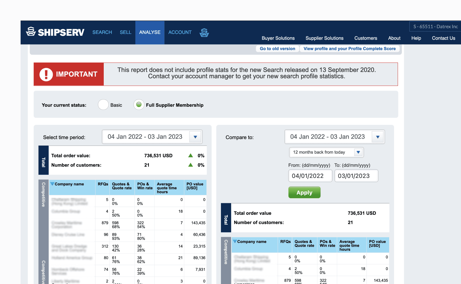
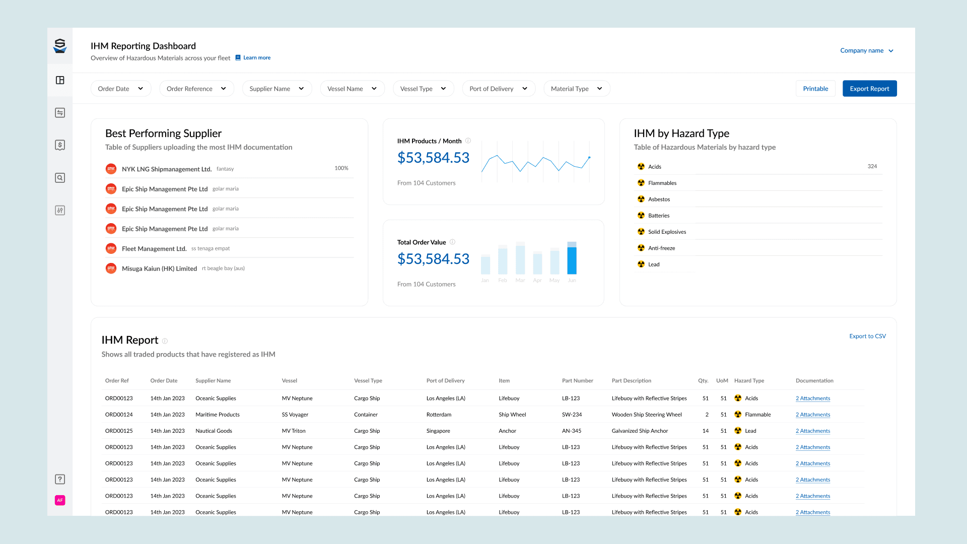
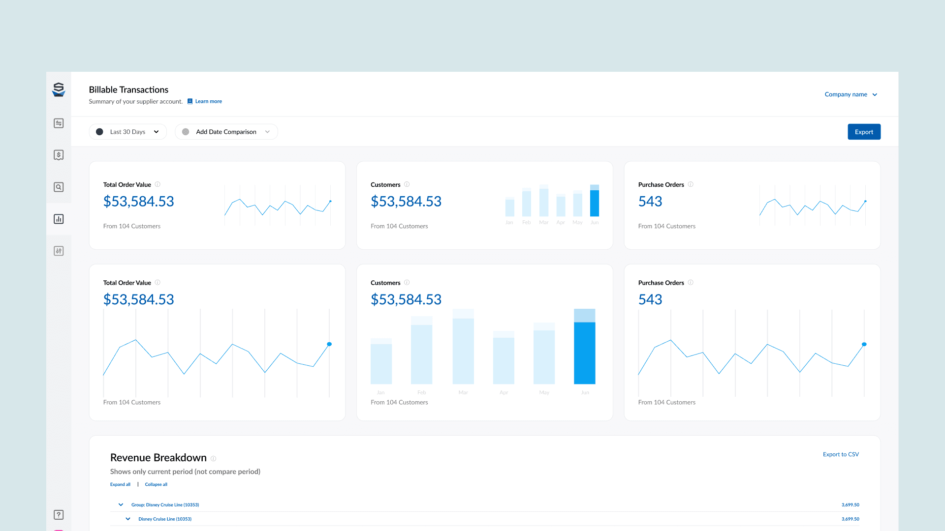
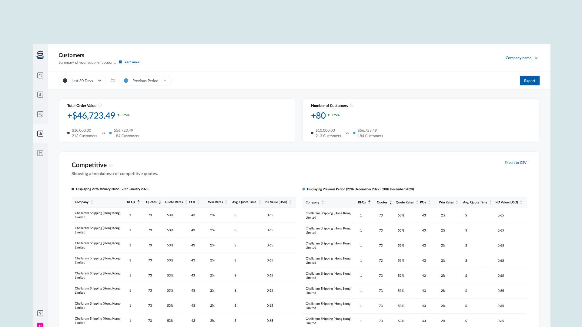
Customers
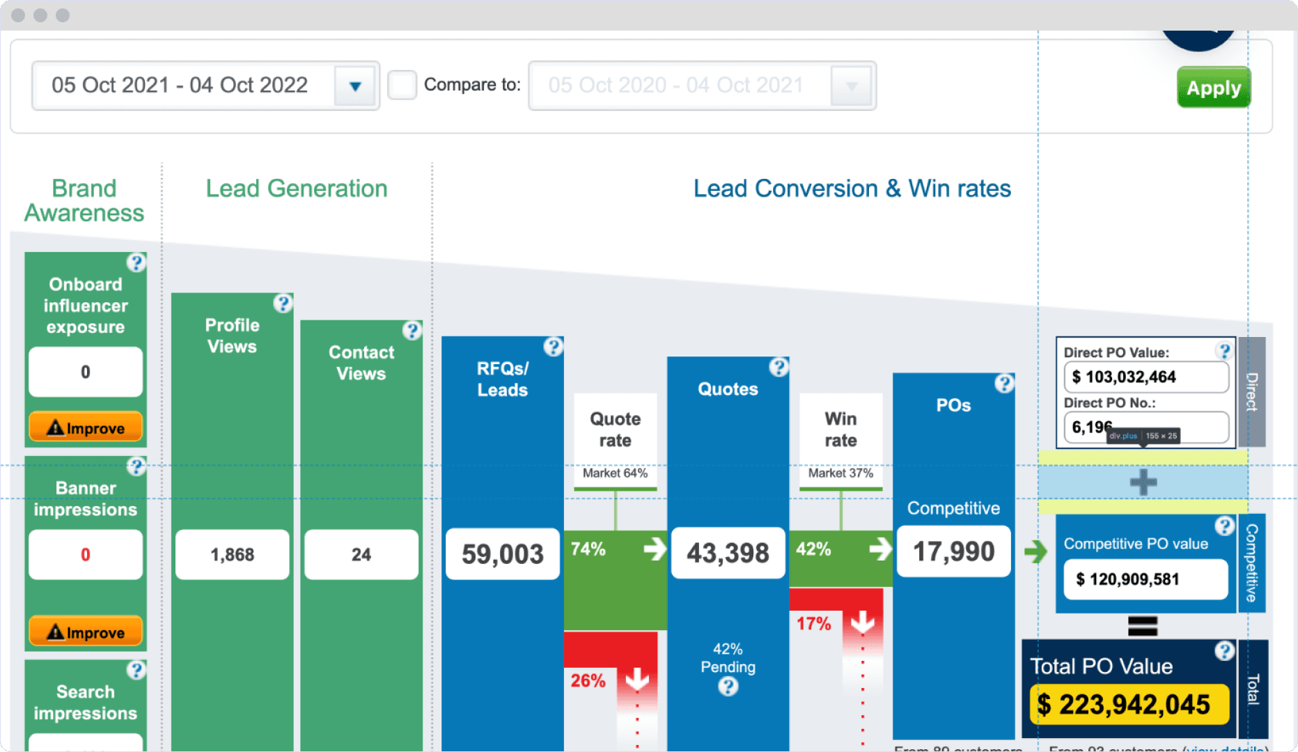
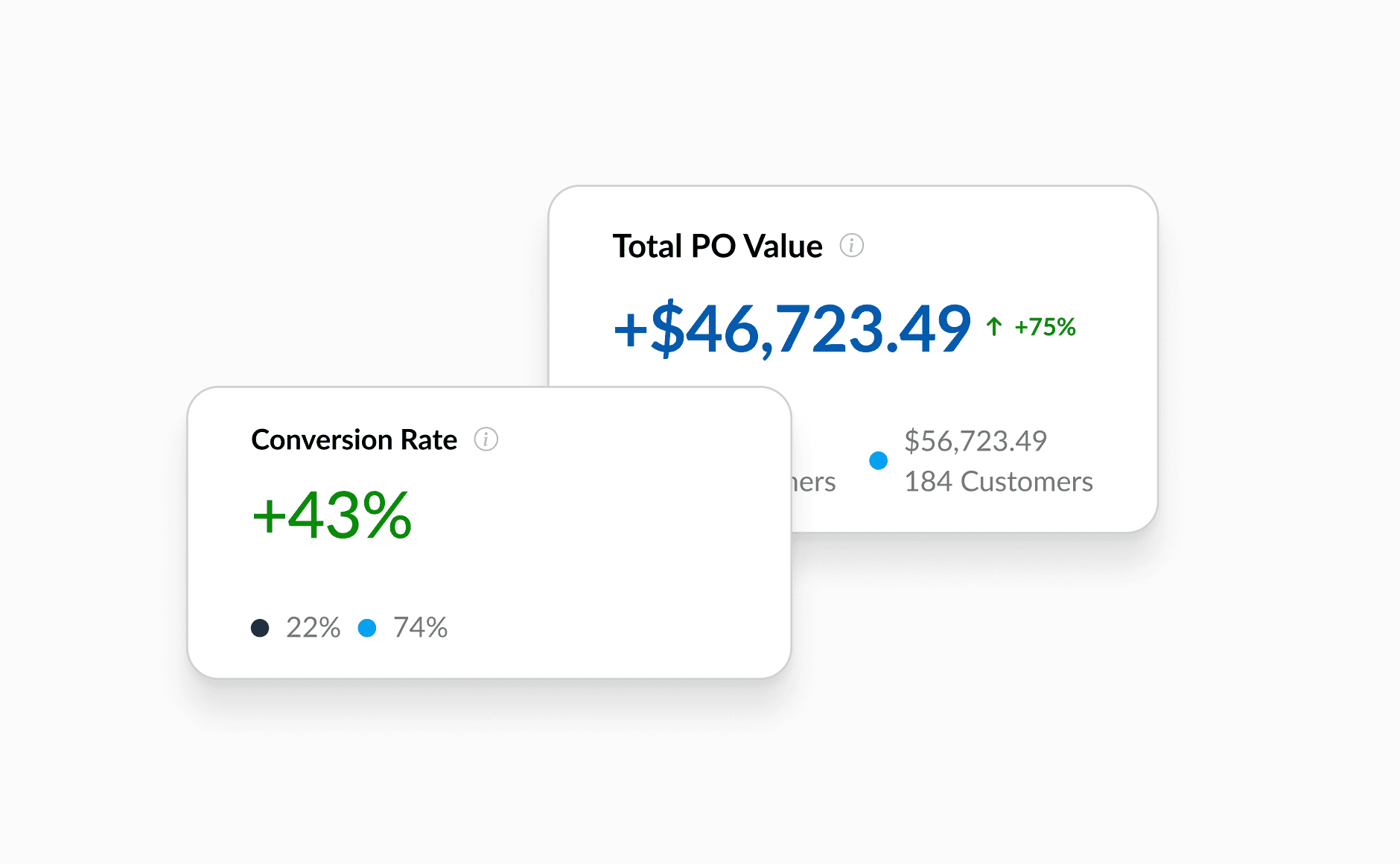
This Reporting tool shows a breakdown of orders from customers, including amount of RFQs, Quotes, and total value
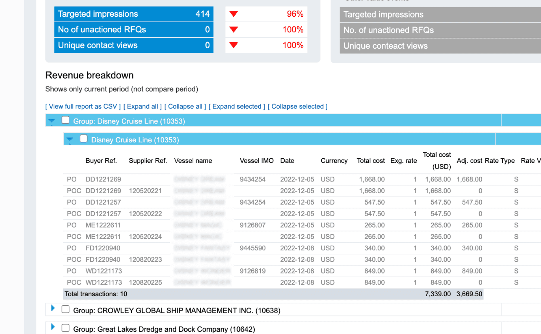
Revenue Breakdown
This breakdown shows the users a breakdown of all individual transactions, with costs and values assosciated to them.
Ideation
Ideating solutions
After gathering some baseline information about the Supplier Report, I started to ideate, and get some ideas down that I had in my mind.
Data viz experimentation
I explored different ways to display the data to the users, and got internal feedback.
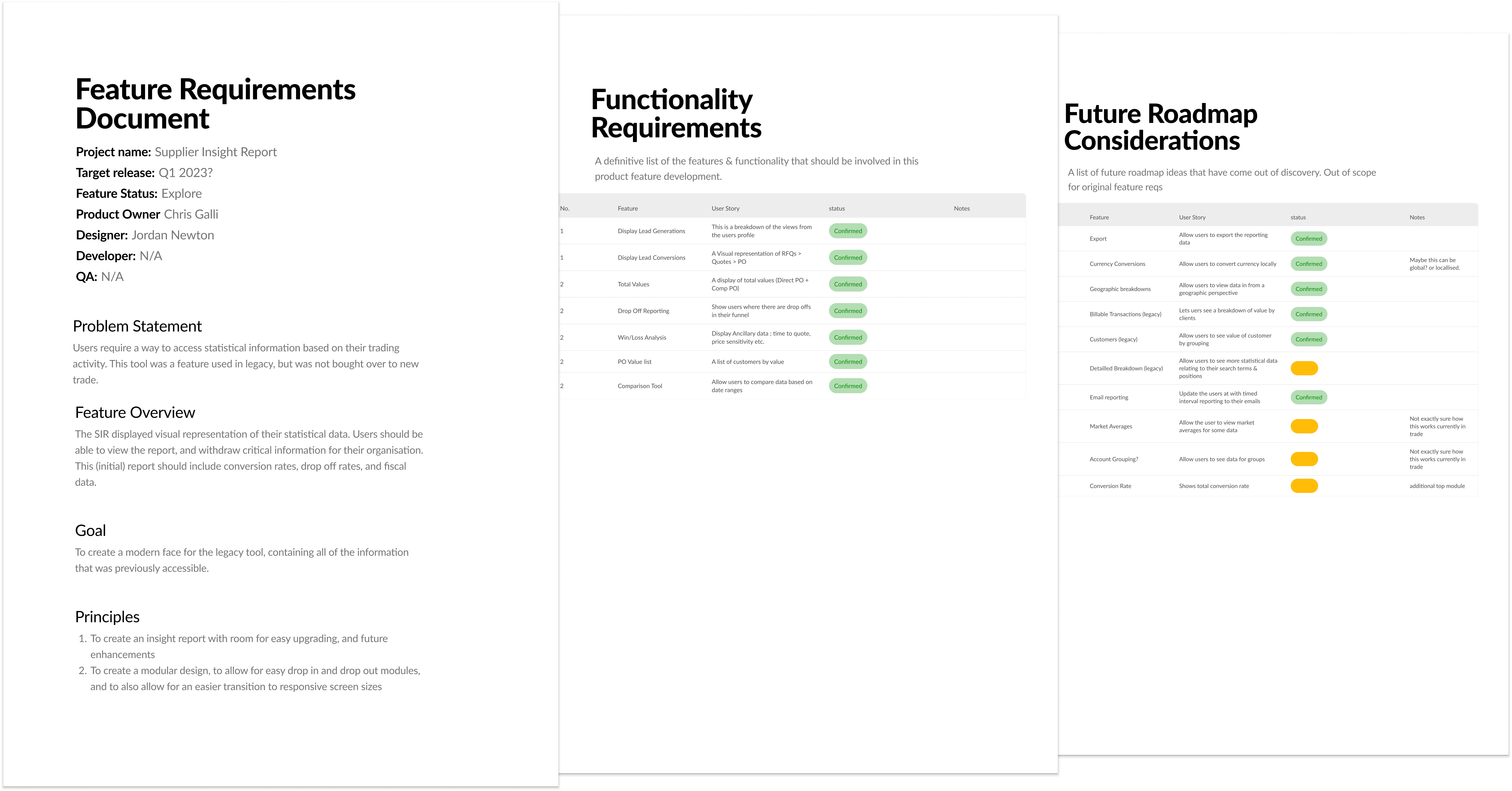
PRD Document
PRD Document
ShipServ had no initial way of collating requirements for projects. I setup a PRD where we could store all the information and artefacts relating to the project

Data interactions
I tried different variations of how a user can interact with the data to get drill down information.
Component Creation
I identified some components we would need to create, and mocked up some ideas on how they can work with the table
Ideation
Prototyping with Figma
Using AI, I was able to build some rough prototypes which we could use for testing. I chose to use Lovable. I was able to prototype a few different iterations to three key flows we wanted to test; autofill, bulk processing & transaction list enhancements
Data Comparisons
Concept 1
Data Comparisons
Allowing the user to upload their buyers invoice, and automatically extract all of the data using our OCR & AI capabilities.
Bulk Processing
Concept 2
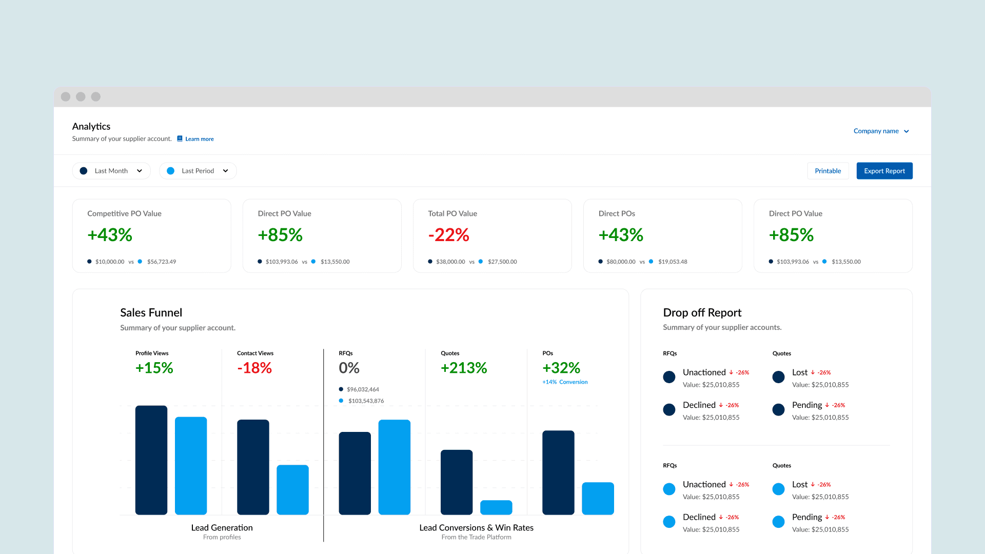
Drop Off Report
A way to show the supplier the total of what happens to all of their incoming RFQs (Unactioned, Lost, Declined & Pending)
Testing
Concept Testing
I used the Figma mockups to test the concepts, and see how usable the interfaces where. I asked my users to complete a range of tasks about attaining information, and finding important data.
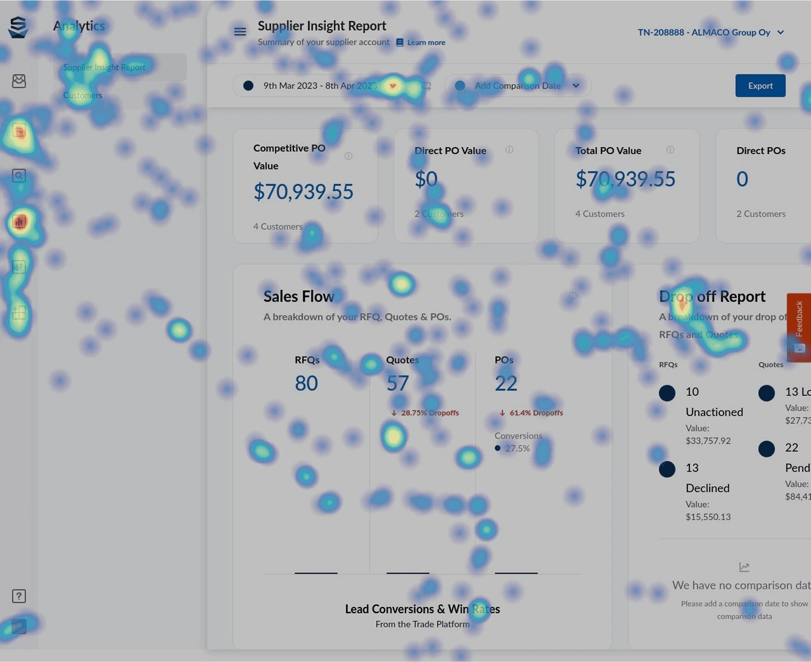
85% Task Success
Clear improvements with the autofill feature with already onboarded suppliers
6/7 Ease of Use Score
Bulk uploading allowed users to drag multiple invoices to send to their buyers.
71/100 System Usabilty Score
General invoice list enhancements saw increased customer satisfaction.
Ideation
Reiterating based on feedback
Users stumbled on a few things in the concept test, which took to me improving the experience by making a few tweaks.
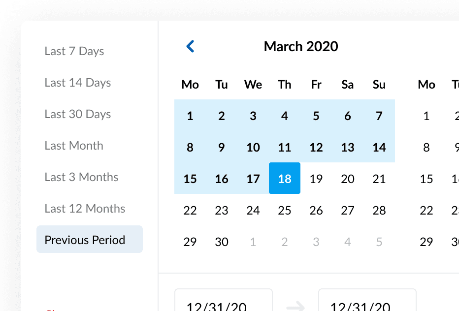
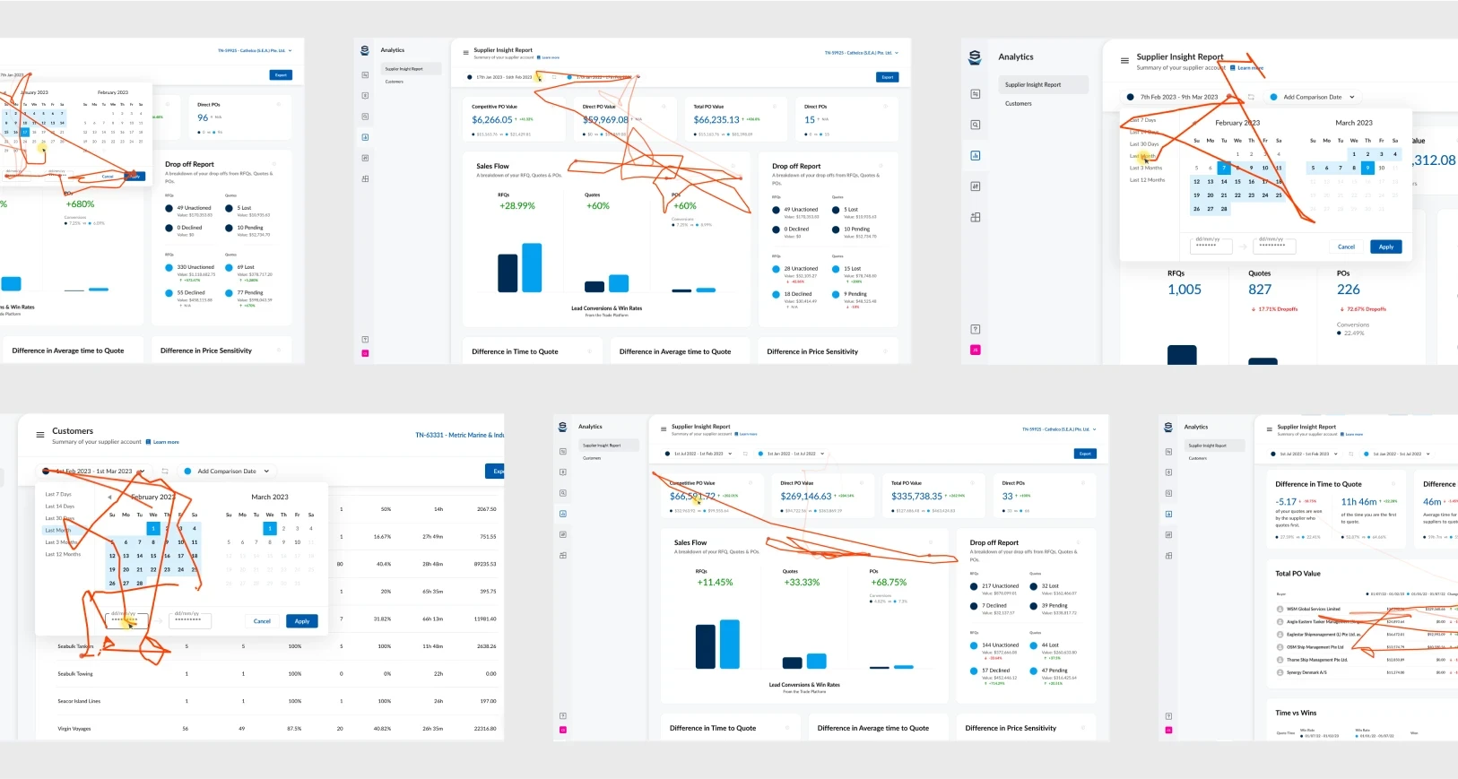
Date Picker Confusion!
Depending on which date you choose first will alter your calculation. To resolve this, I suggested a small date switch button, to allow the user to choose their preference (compare to or against)
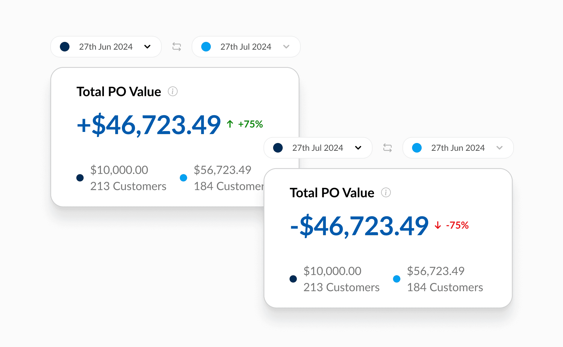
Value vs Percentage
Users found more value in displaying the value, instead of the percentages in comparison mode. Therefore I opted to make the value more prominent than the percentage difference.
Testing
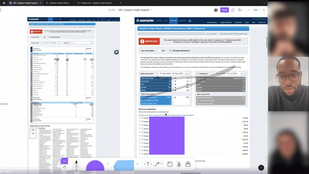
Releasing to Production
We finished the dev work for multiple dashboards, Including Supplier Insight Report. We released these into production after a QA cycle under a feature flag. We continued to measure the dashboards, and made small enhancements with the data.
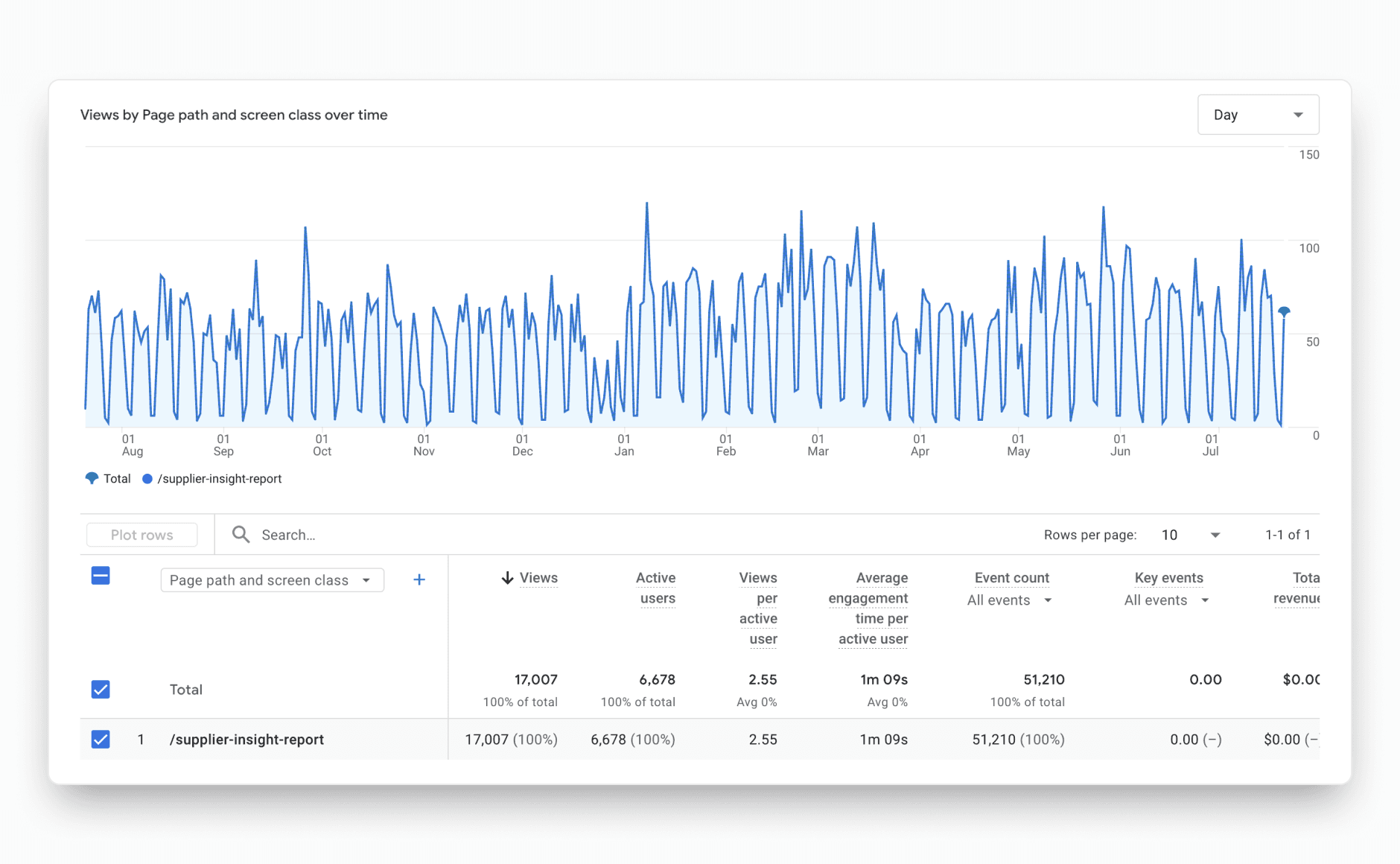
GA4 Page Path Data
Time on Page
We measured how long on avg. a user spent on the page.
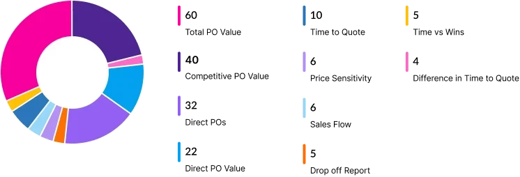
Page Events
We added events to the major interactions, to see which were being used the most and least.
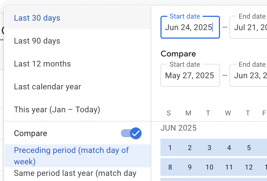
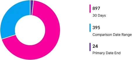
Data Range Analysis
We recorded the most used date ranges, to see how users liked to analyse data.
Repeat Visits
We recorded number of sessions per Supplier, to understand how often a user found it valuable.