Design System
A complete refactor of ShipServ's design system
I was the UX designer responsible for the creation and implementation of the current design system at ShipServ (Lighthouse V1).
The Impact
→ 8% Improvement in Design Velocity
→ 56 Ready to use components
ROLE
UX Designer
TEAM
UX
TOOLS
Figma
Leonardo
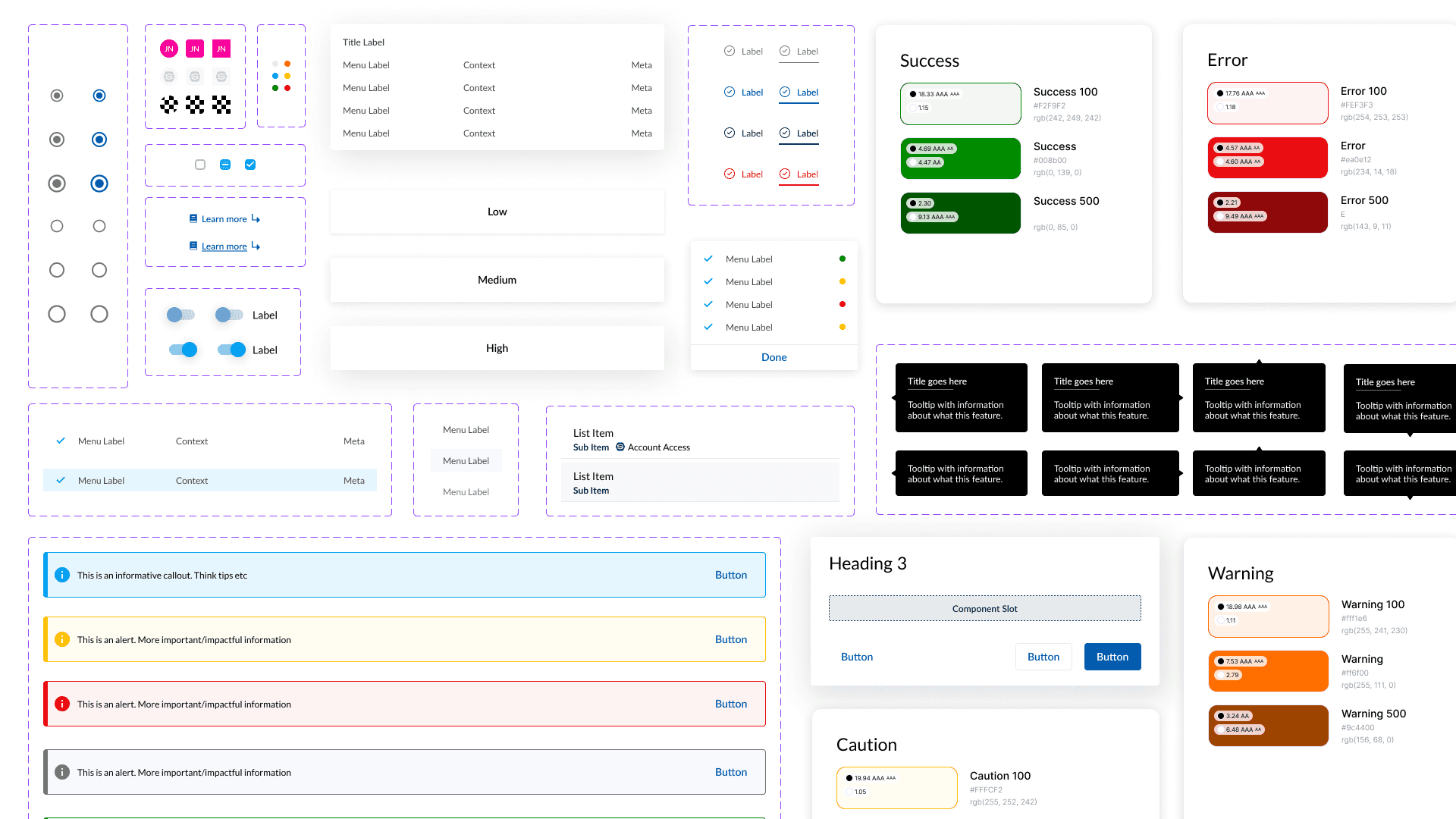
Final Solution


Problem
ShipServ’s original design system helped drive consistency across the platform, but over time it became outdated and fragmented, which lead to various issues around team usage & component consistency.
Team & Business goals
1
Update Design System
Refactor the design system to enable smooth cooperation between design and engineering.
2
Colour Mapping
Refactor the colour system to enable future scaling.
3
Update Component Library
Completely rework the component library to leverage the power of Figma.
4
Integrate Storybook
Help Developers match the components with Storybook library.
Role
As the UX designer, I was responsible for the full refactor & implementation.
→ I created and refactored around 107 components
→ I completely reworked the colour system to allow tokenisation
→ I remapped the typographic system
→ I helped test the integration of the new design system in staging
Why?
1
Platform Parity
A lot of the components did not match their production counterparts
2
Colour Tokenization
Colours did not have order or context, which made tokenization impossible
3
Accessibility
Users complained frequently about colour contrast
4
Maintenance
Figma had introduced new tools which were not being leveraged by the current system
5
Documentation
No documentation was available for any components, which made usage unclear
6
Personal Headache
Using the current design system made designing personally difficult
Original Colour System
Research
Reviewing what we had
I started this project by looking at the current design system in place. This included the typography, component library and colour system. I identified where we could improve, and how we can leverage the full power of Figma to deliver a system which worked for design and engineering alike.
I started to learn and understand the best practices when it comes to creating a Design System, and applied Atomic Design logic to my thinking.
Building
My plan to rebuild
→ Building an adjacent design system to be the least disruptive implementation
→ Build a comprehensive list of components (missing, require refactor, remove)
→ Break down the colour system, and add new colours, removing redundant colours and create a colour mapping
→ Refactor the typography system to remove redundancy
→ Work with engineering to implement the design system
Building
Planning and execution
I started by planning out exactly what i would need, and how i could build it based of the previous system. I started with the foundational aspects, (colours, typography) which would in turn help me build the atoms.

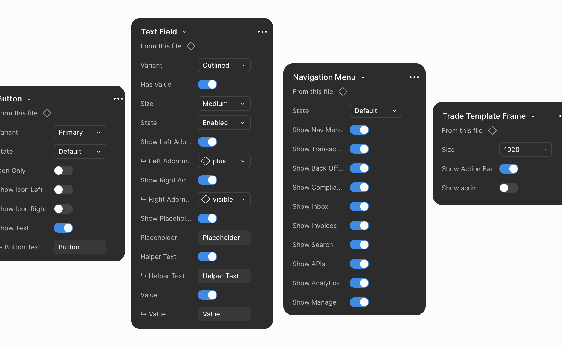
Components List
Part of the comprehensive list, where i would strike out the components that have been completed
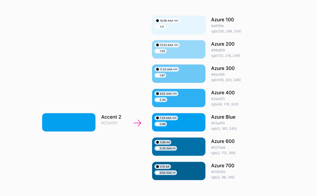
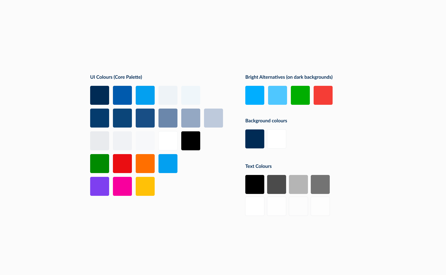
Colour Mapping
Expanding colours, renaming them, and including accessibility guides (Thanks, Foundation)
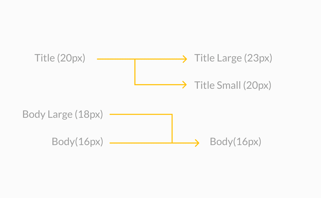
Typographic Changes
I removed redunant typographic classes, and added a few new ones.
Understand Engineering
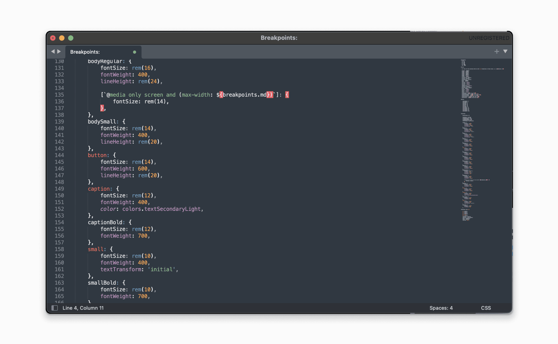
I asked the FE team to provide their stylesheets so i could help align to their code from the beginning.
Building
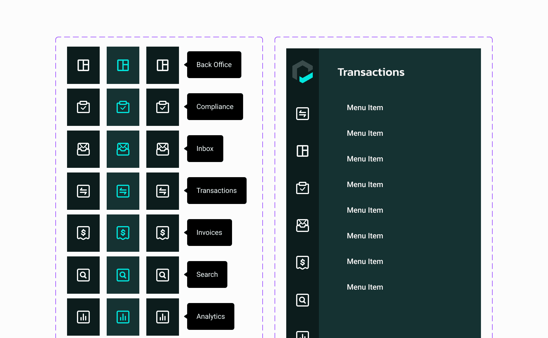
How I built the system
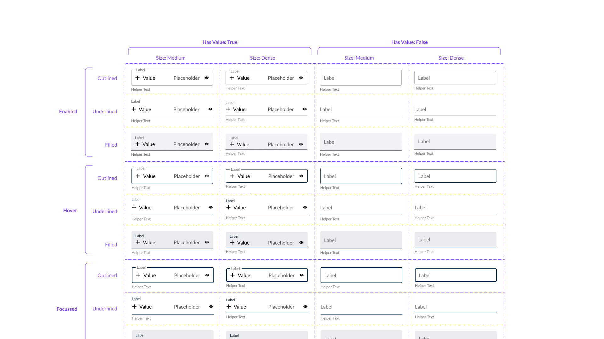
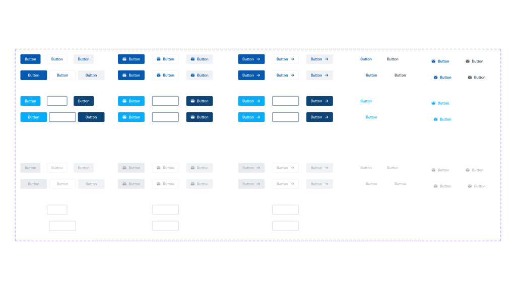
Using atomic design, i started off with the smallest atoms. Buttons! Even at the smallest level, buttons currently had lots of variants and little flexibility. Using nested components and variables, we we're able to drastically improve upon this atom.


Building
Moving On
I continued to work my way all the way through to templates. The design system library now consisted of 56 components, 120 scalable colours and 14 typographic styles (at time of writing). This has enabled our design team to work with a lot less frustration, and concentrate on the project instead of the component details.
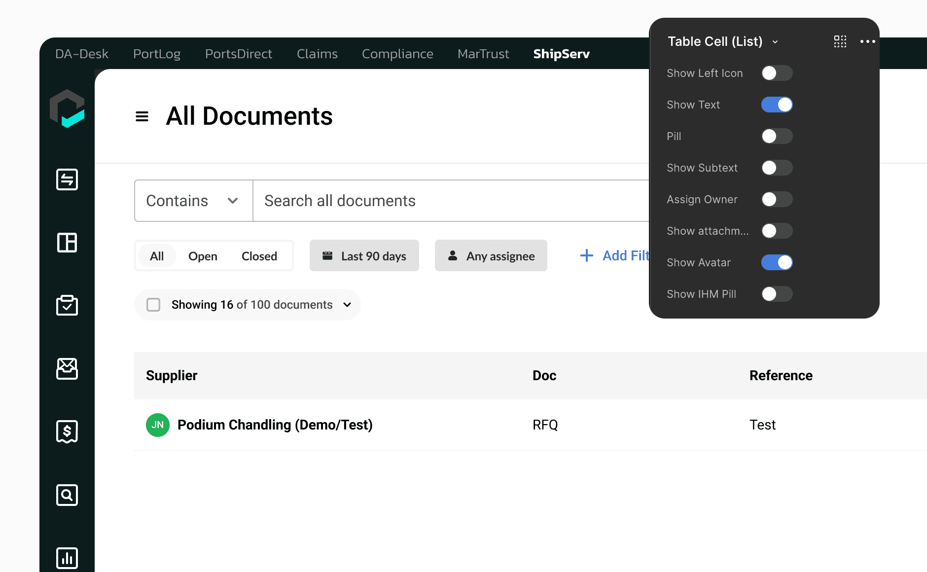
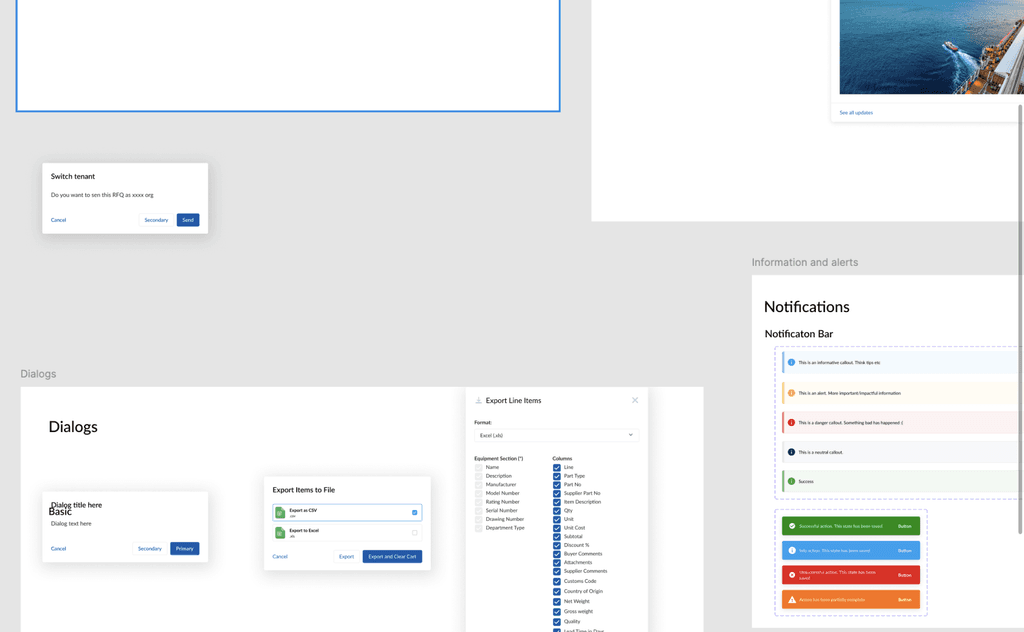
I was particularly happy with creating individual cell components. We use tables very often, and it was pretty difficult to capture every use case in a single component. This component made tables very scalable, and quick to design.

Review
Reviewing the design system
I was extremely happy i was able to build a professional design system which is actually in use for a business. It was far greater in scope than i had originally anticipated at the beginning, but i was able to push through to completion
Key Takeaways
1
Design Systems are hard
Building components is fun, but it only really represents a small portion of what a design system entails. How it translates into production is a much bigger effort.
2
Engineers are needed for success
Without the dev team, we could never have got this into storybook, and acutally implemented, something i didn't think of at the start of the project
3
Design System is for everyone
Between Dev, UX, Solutions & product, the design system is for everyone, and therefore needs to work for them as well as me.